 Positioning an object on visual center
Positioning an object on visual center
Positioning an object on visual center
A feature that I really like on Keynote (Apple's equivalent to Powerpoint) is the generous number of hints given while positioning elements. As an element approaches any symmetry e.g. slide center, other element size, other element's edge, Keynote shows visual cues that really aid an harmonious composition. Powerpoint also does that (and more so in the latest versions) but Keynote is still better, to the point that I use Keynote as a general "drawing" tool for diagrams, flowcharts, and many other tasks for which is not the "right" tool.
Speaking of centering elements, often the geometric center is not the best place to put an element inside another. Often, the so-called visual center, a bit higher than the geometric center, looks much better. I am mildly surprised that Keynote doesn't offer visual center hinting.
In this page, I will show how to calculate the visual center. It is essentially the written version of this video where a funny art professor teaches how to dry-mount a picture.
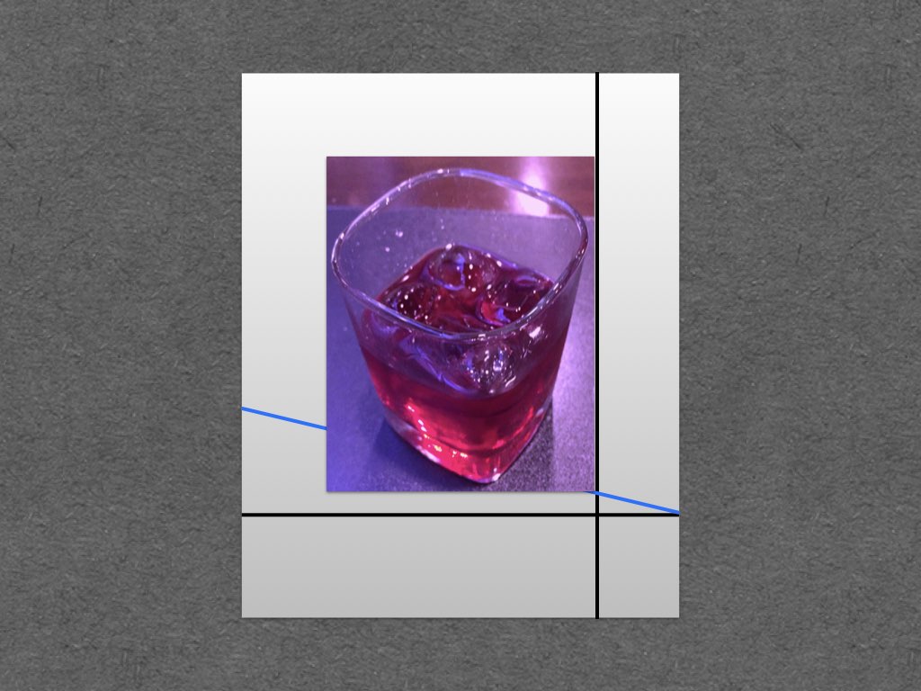
First, let's start with a "picture" mounted on a "frame", which is hung on a "wall". In the simulation below, I have used the geometric center (and yes, I made all figures of this page using Keynote):
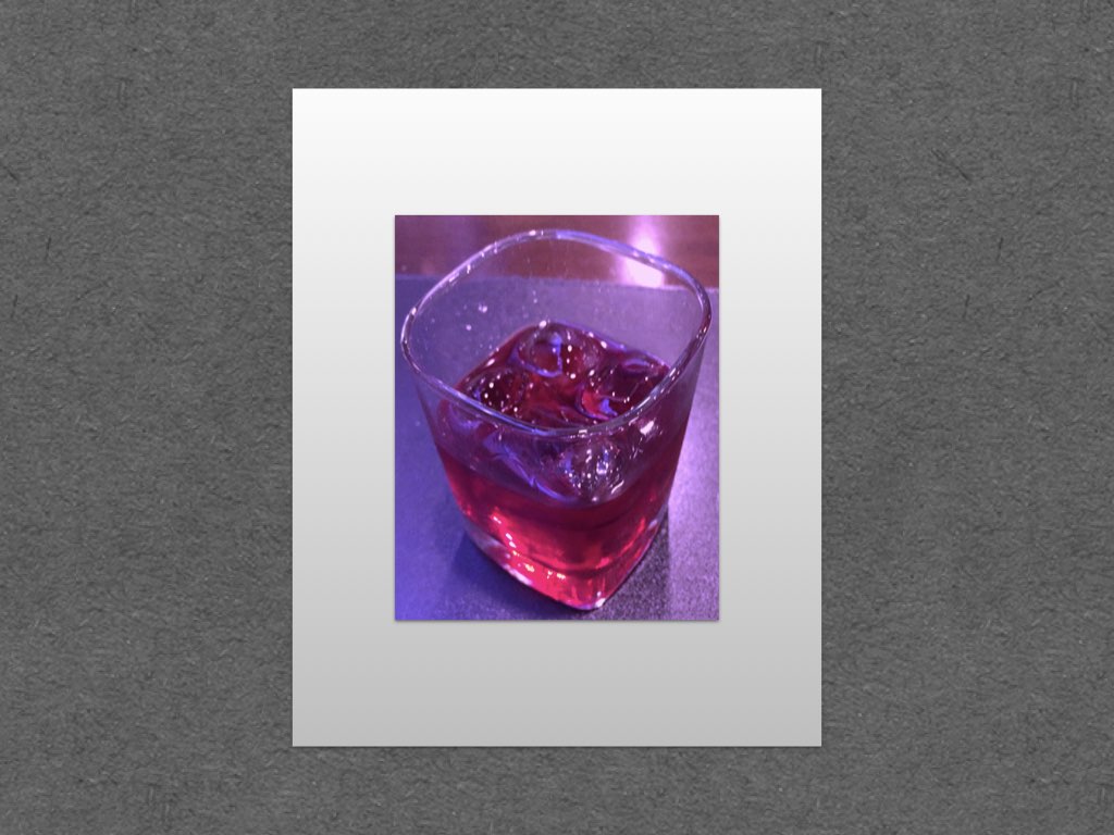
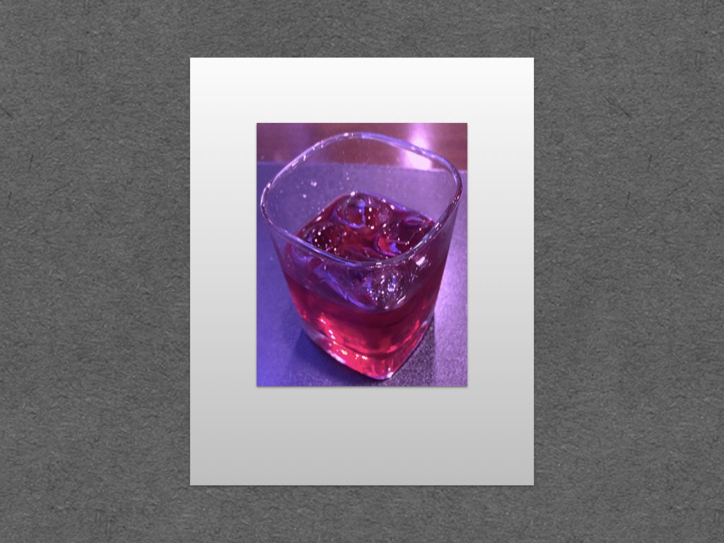
The looks of the figure above is not baaaad, but it might leave the impression that the picture is a bit low on the frame. This negative effect is more evident in real-world frames hung on real walls.
(Just to mention, the picture proportion is around 5:4. The frame is 5:4 as well, and the proportion between picture and frame is near the "golden ratio": 1.618. All of these helps the initial framing to look reasonable.)
To compensate the picture-looks-low effect, we will find the "visual center" of the frame. First, we calculate the geometric center, which is straightforward, it is just a matter of dividing the left-right and top-bottom slacks equally.
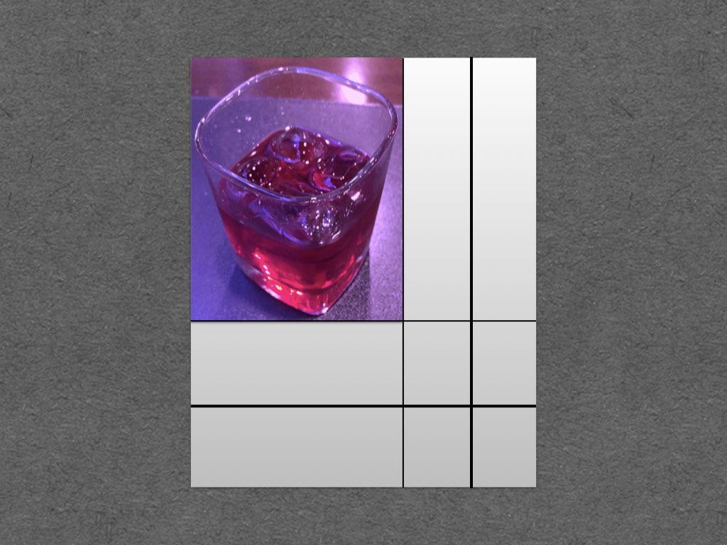
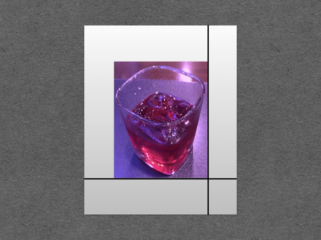
But we want the visual center instead of the geometric center. To find it, we make a straight line as the figure below (blue line):

In my opinion, the visual center positioning is much more pleasant, and this is more evident in a side-by-side comparison:
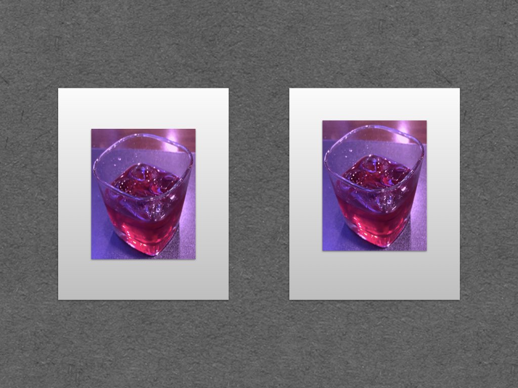
The explanation for this improvement: our eyes tend to aim slightly above the geometric center when we look onto a subject. Some scholars even say that we also aim right off the center, but this is disputable, since there are many of us lefties in this world, and human beings are really good in detecting horizontal misalignments. So, the classic formula for visual center simply keeps the horizontal geometric center.
Actually, the frame positioning onto the wall has to follow a similar rule. In the picture below, I have lifted the frames a bit, without any rigorous calculation of the visual center, and the composition already improved:
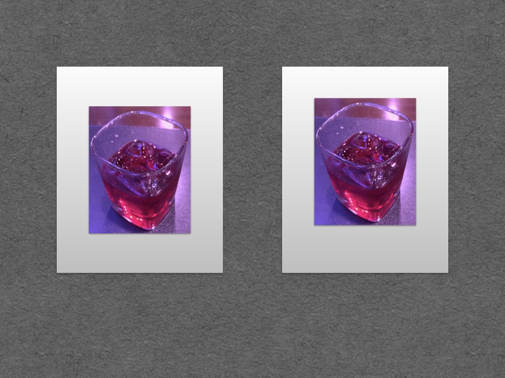
For my own personal taste, the visual center as prescribed by the classic method is indeed nice, but it is a bit too high to really "feel like" the true center of the frame. You can play with intermediate positions between the visual center and the geometric center, to see what looks best.
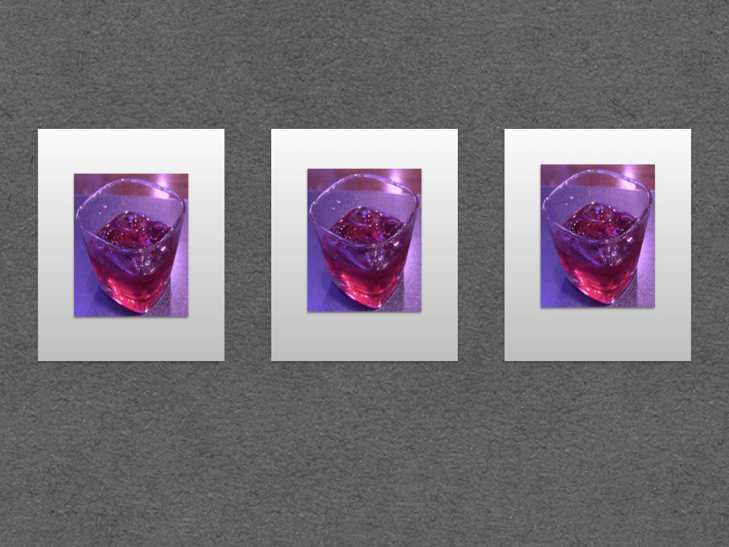
In the picture below, I played with this idea. My subjective sensation is that the center picture, which uses the average between visual and geometric positions, is the most "centered".