 What is a color gamut
What is a color gamut
What is a color gamut
A fact unknown by the layman is, every device that displays or records colors e.g. a color TV, a color printer, a camera, etc. has severe limitations in color reproduction. Color gamut is the color pallete that a given technology or process is capable of reproducing.
This is why we can discriminate between natural and artificial images at a glance — e.g. what you see through an open window versus a picture or a TV screen mounted in the window's frame. And we can tell apart an analog TV, a digital TV, a printed picture, etc. because every media has a different 'look' regardless of resolution.
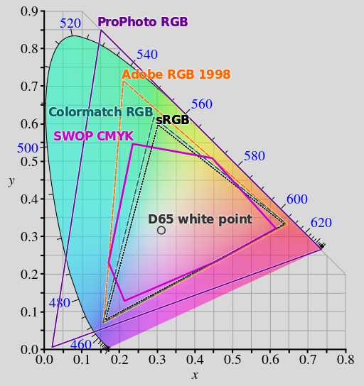
In order to understand gamut, it is important to understand the CIE diagram (Figure 1). It is the result of extensive research about human vision. It is also known as the "horseshoe diagram", and its funny shape will be explained soon.
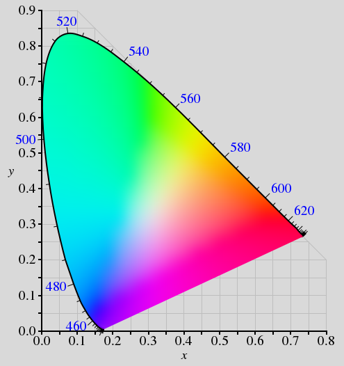
The upper curve delimiting the shape, which resembles a horseshoe, is related to pure colors — the ones we can see in a rainbow. The colors exactly on this curve are the only ones that actually exist in nature. The blue numbers are the wavelengths of each color. For example, red has a wavelength of 620nm or 0.000620mm. For comparision, a microwave radio signal has wavelengths between 30cm and 3mm.
Only lasers can generate the pure colors at the borders of the diagram. More mundane technologies always add small amounts of other colors. This limitation has important consequences, as we will see. In particular the violets (bottom left corner) are very difficult to generate in their purest forms.
The bottom edge of the diagram, a straight line, is called the "magenta line". These colors between violet and red are not rainbow colors. When our eyes are stimulated by a mixture of blue and red, or violet and red, then we "see" colors like purple, magenta or pink.
The colors in the bulk of CIE diagram are "less pure" than colors at the edges. Near the center, the colors are very pastel. The white color has its spot in the center, since white is a perfectly balanced mix of all rainbow colors.
The white color is the limit case. Mixtures that are almost but not quite balanced will look like pastel colors, but still have a discernible shade (e.g. pastel red).
Now, a demonstration of how the CIE diagram format aids the "calculation" of a color mix. Figure 2 illustrates a mix of red and green.
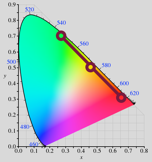
In Figure 2, we draw a line between the two exact tones involved in the mix (a shade of red and a shade of green). When these two colors reach the eyes, we cannot see them individually: we see the middleway color, a shade of yellow.
If we mix these colors in different proportions, the apparent color still belongs to this line, but the share will be nearer to the stronger color. For example, a mixture with 75% red would render a shade of orange (a quarter way between red and green).
We can even determine the result of three-color or n-color mixes. If three colors are involved, draw a triangle and find the center. The mixture will look like the color at the center spot.
This is the strength of the CIE diagram: it allows to calculate any color mixture with a simple interpolation. The strange shape format and the color distribuition within the shape serve to this purpose: calculate mixtures using simple straight lines.
Two details must be observed. First, the CIE diagram is valid only for human vision. For example, birds have four color receptors, and their subjective sensations to color mixtures are certainly different, implying a very different CIE curve.
Second, the CIE diagram assumes additive mix, that is, a sum of colored lights, not a mix of pigments. If you mix red and green paints, you won't get yellow, you'll get a murky brown-violet — because red paint is not red, it is a substance that absorbs non-red colors. Mixing paints is like mixing color filters, and the result must be a more restrictive color filter.
Since the human vision has three color receptors, and the CIE diagram format is roughly triangular, the most popular color reproduction methods also employ three primary colors. Two colors is too little (even though the first color movies actually used two colors, with interesting results). Using 4 or more colors is expensive, nonstandard, and (as of today) no implementation has delivered truly superior results.
Figure 3 shows the gamut of sRGB standard. It is employed in most computer monitors, digital TVs, movie and still cameras, etc. The triangle inside the diagram shows the colors that sRGB can reproduce; the arc curve represents color temperatures, a subject we won't discuss here.
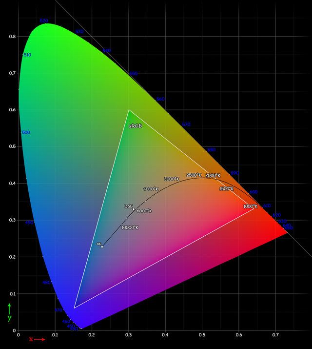
First thing we see in Figure 3 is, the triangle vertices (tips) that represent the purest colors employed in an sRGB monitor, are not in the edge of the CIE diagram, so they are not 100% pure colors. This choice of impure primary colors shrinks the gamut area. In particular, the green tip is very distant from the edge, so sRGB primary green is very impure. Why's that?
The reason is: generating pure colors is expensive.. The screen "phosphors" cannot produce 100% pure reds, greens or blues. Or perhaps the best phosphors are too expensive. The chosen primary colors of the sRGB standard are a balance of color fidelity and cost, and I think they also take other things into account, like mass production viability, yield rates, failure rate, useful life, etc.
In practice, the sRGB gamut is not such a crippling limitation. Even though the blue vertex in gamut does not reach violet, an sRGB screen still can show shades of violet. The only thing is, violets on the screen won't look as saturated as e.g. violet flowers found in nature. (I have mentioned violet because it is a difficult color; lots of cameras get the colors wrong when taking pictures of violet flowers.)
The same happens with other colors not covered by the sRGB gamut. It can show shades of yellow, cyan, aquamarine, etc. all right. They just won't be as vibrant as real-world colors can be. On the other hand, the gamut's red and blue vertices are near the CIE edge, so the shades of red and blue do look pretty good on screen.
Not that other technologies don't try to cover more colors. Figure 4 shows the gamut of many of them.
Photography entusiasts are divided between sRGB and Adobe RGB, more or less like Democrats and Republicans. Good digital cameras can do Adobe RGB, but then the photographer also needs to have a screen capable of Adobe RGB gamut, otherwise the editing process will throw colors off-beam.
Of course, the idea of Adobe RGB is to get a better gamut at the last step: printing. Amateur photographers need to check if the print service "understands" Adobe RGB. Naturally, big-time book and magazine publishers have the necessary equipment to use Adobe RGB end-to-end.
Figure 5 shows a cyan-green sRGB gradient. Clicking or touching the image toggles between Adobe RGB and sRGB versions. Both images are exactly the same, only the color profile is different.

You will only see a difference if the screen and the browser and the operating system support Adobe RGB. For example, I could see a difference in Safari for Mac, but not in Chrome for Mac. [That was in 2014; in 2020, Chrome for Mac seems to show Adobe RGB images just fine.] You can try to download both images and compare them using other software. Still talking about Macs, Preview and iPhoto show differences, but not Gimp. I was actually surprised to see any differences in my monitor since it is not a "pro", wide-gamut model.
On the other hand, the sRGB image on Chrome shows the same vibrant green of the Adobe RGB image in Safari. While Safari obeys the strict limits of sRGB, Chrome (and most other software, as well as all mobile devices) shows the most vibrant colors available. An explicit conversion from Adobe RGB to sRGB could result in bland images on the screen of your audience.
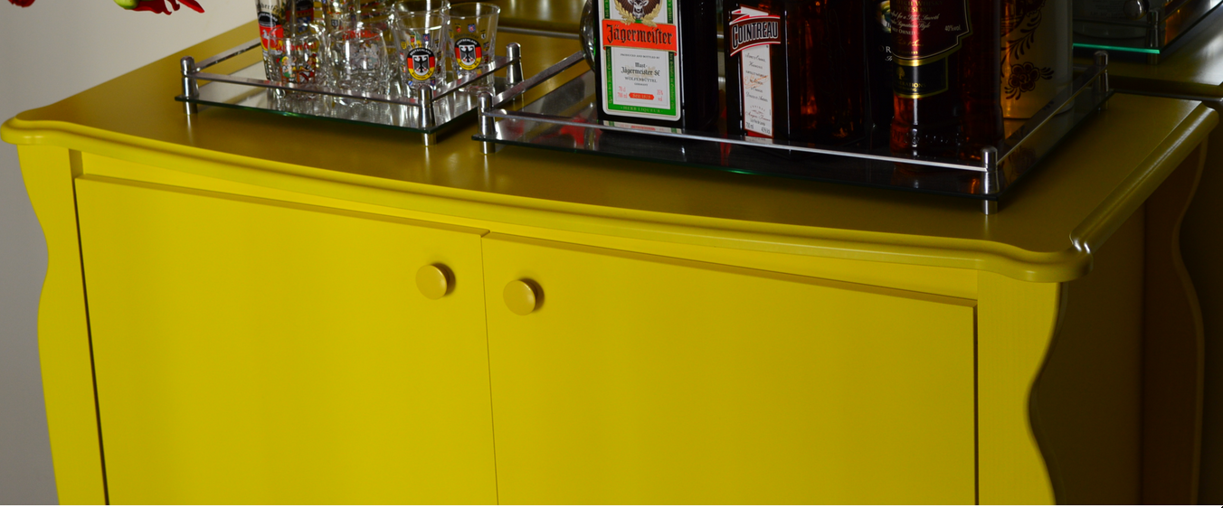
In order to stress the point, there goes another example: a yellow cabinet. Saturated yellow is another color that Adobe RGB can show, and sRGB cannot. I took two pictures of the same object, one with Adobe RGB configured in-camera, another one sRGB. The following images are the original camera files:


In Safari or Preview, Figure 7 shows a dull yellow that does not make justice to the actual object. This is expected due to sRGB limitations. But in Chrome and iPhone 5, Figure 6 shows a greenish yellow, while Figure 7 looks ok.
Then, I took a number of screenshots to try to illustrate how these pictures can look different according to color profile and viewing software. Since a screenshot captures the "native" pixel values post-monitor calibration, Figures 8 and 9 may present weird colors on your screen.


On my monitor, Figure 8 looks best. This is expected, since everything conjures up for this result. But Figure 11 looks pretty good, too. In iPhone 5, Figure 11 is definitively the best. In a Galaxy Nexus, Figure 9 looks the most faithful.
These technology blunders justify the pragmatic advice of using sRGB exclusively, at least when the final destination of your pictures is the Web.
It is also worth of mention the Wide Gamut RGB system, also created by Adobe. This system specifies pure primary colors, creating an enormous gamut. As we said before, pure colors are difficult to generate, but the techological evolution is closing the gap. For example, OLED screens have wider gamut than LCDs.
Using more than 3 primary colors is another way to increase the gamut, making it a polygon instead of a triangle. From time to time, some new technology tries this path e.g. the Sony RGBE color sensor with cyan pixels and Sharp Quattron LCD with yellow pixels.
This article describes Wide Gamut in the context of 4K TVs and other related features like 10-bit color resolution.
The ProPhoto gamut, also present in Figure 4, adopts a funny strategy to increase gamut: two of the primary colors are "imaginary colors". Namely, a super-blue and a super-green. What are these "imaginary colors"? They are colors with saturation higher than we can normally perceive.
The color receptors in our eyes are not perfect; every receptor can be stimulated by any color, at least a bit. For example, the green receptors are slightly sensitive to violet, and they register some signal even when looking to a violet monochromatic laser. The color may be 100% pure but we still see it as just 99% pure.
On the other hand, a good artificial sensor can distinguish colors better than a human, so a device can define its own gamut based on the most pure primary colors that it can distinguish.
Of course, the accurate reproduction of these "imaginary colors" wouldn't be fully appreciated by anybody. A printed super-blue looks just like ordinary blue. But that's ok. The idea of using super-primary-colors is to cover more gamut, and reach those saturated secondary colors that are visible, like saturated cyans and yellows.
There is a trick to see a "super color". For example, to see a super-green, paint your screen magenta (using Paint or Photoshop) and have another full-screen green image handy. Keep looking at magenta for two minutes, then switch fast to green. Since the red and blue receptors were "worn off" by magenta, they will black out, and you will see a green more saturated (pure) than usual.
The same trick can be employed to see saturated yellows and cyans on sRGB monitors that normally cannot reproduce these colors.
The CMYK printing technology, present in books, magazines, printers, etc. has the best cost-benefit relationship. But CMYK is very limited in gamut. It surpasses sRGB only in saturated cyan and yellow, since these are primary CMYK colors. Reds, greens and blues look somewhat dull in CMYK.
Subtrative color is, just by itself, an enemy of the gamut. And, likewise the primary sRGB colors, CMYK pigments are not perfect. The purest and more exact a pigment, the more expensive it is. Just look at the price of a typical inkjet printer cartridge.
To achieve a wider print gamut, the solution is to use more primary pigments. The Hexachrome system adds green and orange to CMYK. The Pantone color pallete, widely used as authoritative color reference, employs no less than 14 different pigments.
Photographic film (now obsolete) and paper have the reputation of delivering wider gamut than current digital technologies. In particular, the slide film has great saturated colors.
It is interesting to note that films also employ subtractive mix of three colors. Probably, two details of the processing compensate this limitation. First, a film is "read" by transparency, while in a print the light must cross the pigments twice and be reflected by the paper. Second detail is that every batch of film or photographic paper is tested and compensated for color correction, so any small deviation in pigments is compensated for.
A residual problem in photographic film is the loss of gamut space when they are scanned, since the scanner will have its own gamut limitations (it can be sRGB-only). This will rob some of the original colors.
I had mentioned that violet is a "difficult" color. Many digital cameras, at least the older ones, struggle when capturing certain tones of "purple". Maybe you have had this experience: took a picture of a beautiful purple flower and it showed up blue on the screen.
First thing is, we tend to name "purple" a range of colors that are spectrally very different, like violet, purple, pink, magenta, rose, lavender, etc. Violet is a true color: it lies between blue and ultraviolet. The other colors are mixtures of violet and red, or blue and red, that our brain recognizes as sui generis colors.
To make things more complicated, our eyes can be "fooled" by a mix of dark blue and a little bit of red. This mix looks violet, if less saturated than spectral violet. So, when we see a violet-like object, it is impossible to tell whether it is really violet or just blue+red. (We can know for sure by using a red light; if the object is truly violet, it will look almost black.)
Every color technology can reproduce magenta or pink; it is just a matter of mixing red and blue in correct proportions. The same happens for non-saturated violets like lavender. The problem is reproducing saturated violets; the more saturated we want it, the more difficult and expensive it becomes.
A way to extend RGB technology into violets (and increase the gamut) is to use violet as the "B" primary color. This is exactly what the Wide Gamut RGB does. In this system, blue is generated by a mix of violet and green. Three practical issues: violet dyes and light sources are more expensive; the human eye is poorly sensitive to violet, so more power is necessary to achieve the same apparent brightness; and intense violet light can damage the eye (UV, violet and even blue light can damage the eye given enough exposure).
Reproducing violet is difficult; capturing it is an even bigger challenge, because the typical Bayer sensor has red, green and blue pixels. Violet light excites only the blue pixels, and the camera "sees" violet as a very pure blue. That's why older digital cameras confuse the two colors, and violet flowers come out as blue.
The human eye can tell violet apart from blue since the "blue" (S) receptors are actually more sensitive to violet, and the "green" (M) receptors are quite sensitive to blue, but not so to violet. The brain can distinguish violet from blue by the difference of S and M responses.
Moreover, in relative terms, the "red" (L) receptors are more sensitive to violet than the "green" (M) ones. (The absolute sensitivity of all 3 receptors to spectral violet is very low, so it is always perceived as a dark color.) This is the probable reason why a mix of red and blue passes off as violet or purple-like.
Since we have mentioned it, it is interesting to clarify that L receptors are not very sensitive to red; they are most sensitive to lemon-green! As happens with violet, the red color is perceived as a dark color because only the L receptor is (poorly) sensitive to it; the M and S receptors are completely blind to red. The M receptor is most sentitive to bluish green, and S receptor is most sensitive to blue-violet.
Current digital cameras can also distinguish violet in some fashion, even though the details are scarce (each manufacturer has its own "secret sauce"). Three major strategies are possible: 1) use violet pixels instead of blue ones; 2) consider that green pixels are a bit sensitive to blue but not to violet; 3) use red pixels with dyes that let violet pass through as well.